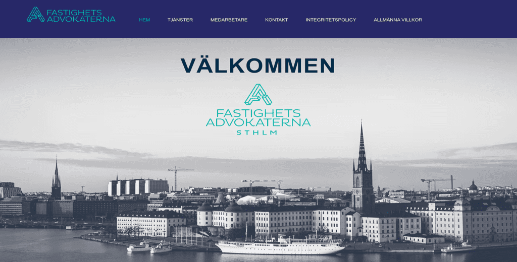
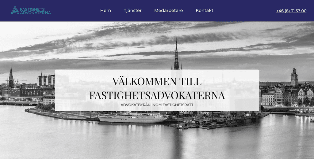
The goal was to find a homepage of a website that could be improved. I found a Swedish lawyer website that did not seem to be designed by a professional.
There does not need to be two logos in the hero section since it makes it look a bit unprofessional in my opinion. It now looks cleaner and creates a better first impression.
Improved the introduction to clearly explain what the company offers the moment a visitor lands on the page.
In the header, I added a phone number for quick contact and moved secondary menu items to the footer to reduce clutter.
Restructured the content to remove repetitive info and added clear Call-to-Actions (CTA) to guide the user.
Added a quote to give this section more purpose. Previously, it functioned only as an empty image divider.
Cleaned up the footer by removing duplicate links and organizing the layout for a more polished, professional look.”
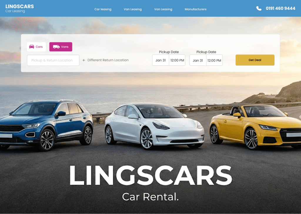
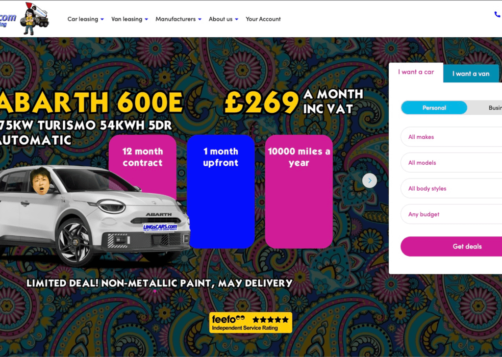
This project was about taking an existing website and redesigning the interface and workflow to improve the user experience and drive more sales. In this situation, I found a website for car-rentals that could clearly be improved.
The original website felt very cluttered. I focused on removing unnecessary elements to create a smoother and better user experience.
I redesigned the search bar to be more logical and professional. The previous one was not optimal.
I kept the original brand colors but used them more intentionally. This prevents overwhelming the visitor and highlights only the most important information.
I redesigned the filters to improve both look and logic. The new system is much easier to navigate and helps users find what they need faster.
The section where cars were displayed felt unprofessional. I updated the layout to make it look more modern & clean.
To reduce user frustration, I grouped functions onto a single page, removing the need to navigate back and forth between pages.
This was mainly for improving the eshethic look of my own website, i felt especially that the color choices i did with the old website was very bad. Note: My pingefy.com website does have a third design at the moment.